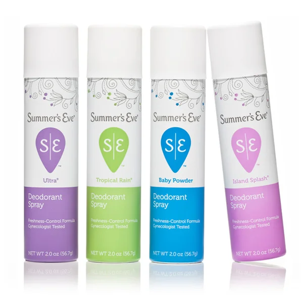
Summer’s Eve
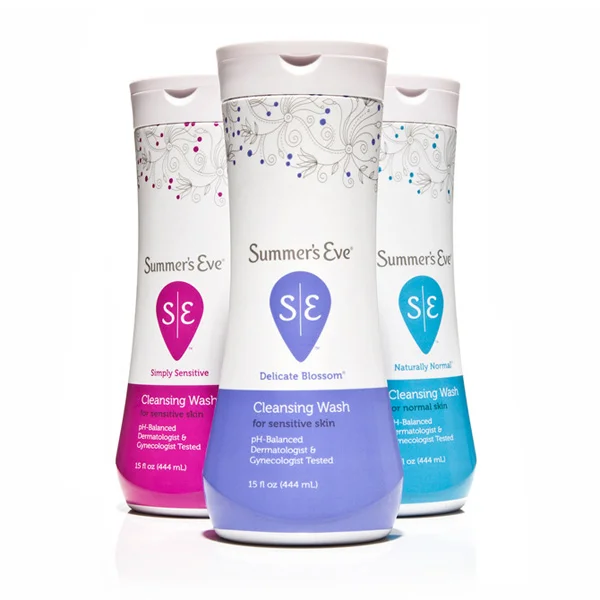
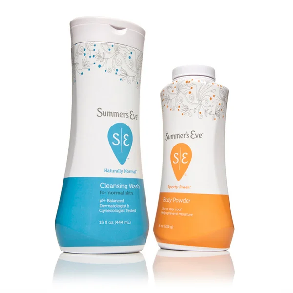
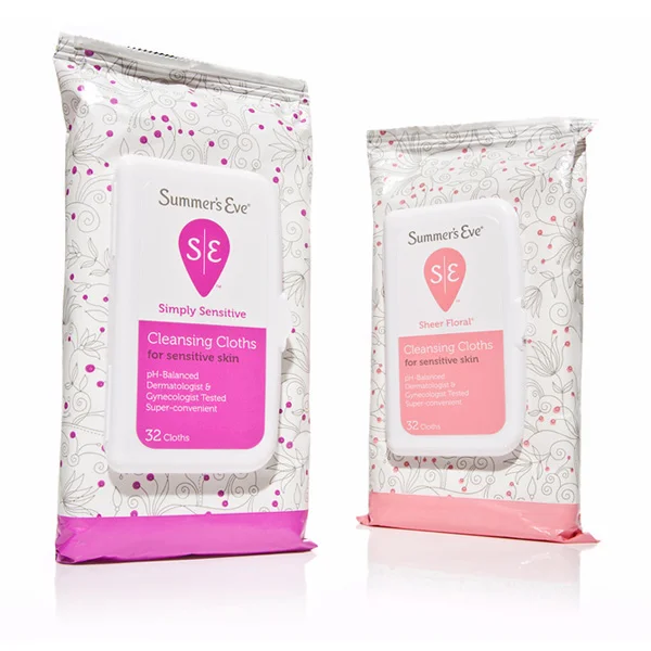
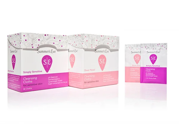
/Little Big once has showen their true passion for brand development and design with Summer's Eve. Here was their challenge: With the last true brand redesign happening more than 20 years ago, Summer’s Eve, while continuing to grow, was also continuing to lose relevancy with women. We needed to reinvent the brand and fight category stigmas and embarrassment.Solution:Consumer insights were key to both the structural and graphic redesign, with nearly 3,000 women weighing in on the process through ethnographies, focus groups and quantitative studies.The Summer’s Eve identity was completely overhauled and given an upright script that lives understated on the top of the package. More prominent is the Yoni symbol which holds an S and E. The Yoni is an ancient symbol of female genitalia. The custom illustration on top of pack lends a contemporary, feminine appeal, while the bottom of pack boldly color codes flavor and locks up product type and claims.

