Dukes Smoked Meats

Created by Moxie Sozo

CLIENT

Duke’s Smoked Meats was founded in 2013 by Justin Havlick, a man whose brother once called “the Duke of Jerky.” Today, the brand has become a beloved favorite in the smoked meats category.

Duke’s promises fresher cuts of meat; real, whole ingredients; inventive, unexpected flavor combinations; and a small batch commitment to quality. These things, when combined with passion, result in some of the most exciting (and best tasting) products on the market.

CHALLENGE

Even though people who’ve tried Duke’s love it, the brand was having trouble selling through. They needed to drive trial. The brand engaged Moxie Sozo for help getting more people to pick up Duke’s off the shelf.

Our conversation began with a simple assertion: the packaging could do more to engage consumers at the point of purchase. It had to better communicate Duke’s unique taste, craftsmanship, and personality.

To win at retail, the packaging would have to seduce shoppers away from larger established category leaders like Jack Links, Slim Jim, and Oberto, as well as beating out disruptive up-and-comers, such as Krave, Fusion, and Chef’s Cut.

SOLUTION

Moxie Sozo reimagined the Duke’s Smoked Meats brand, putting taste appeal front and center, helping to communicate the brand’s greatest differentiator: outstanding flavor.

The bold, hand-drawn ingredients on-pack reinforced the product’s handmade craftsmanship, and the clean, modern, minimal aesthetic helped to justify its premium price point. Perhaps most importantly, it stood out on-shelf.

RESULTS

A year after Duke’s grew its market share, Chicago-based ConAgra Brands purchased the brand’s parent company, Thanasi Foods. ConAgra’s president and CEO cited the brand’s premium, modern aesthetic, and meteoric growth as key reasons for the acquisition, and we continue to work with Duke’s Smoked Meats as they continue their carnivorous quest for category domination.

Arbru Premium Beer

Arbru_1.jpg
Arbru_2.jpg
Arbru_3.jpg
Arbru_4.jpg
Arbru_5.jpg
Arbru_6.jpg
Arbru_7.jpg
Arbru_8.jpg

Created by Lauft

There is no Planet B.


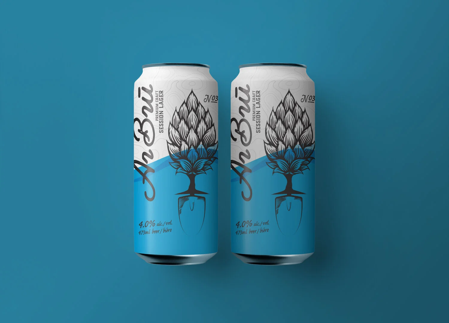
Founded by a mission of love for craft beer and nature. Arbru stemmed from the name Arborist. This craft brewery is developing Canada's first off-the-grid microbrewery. The staple hop and shovel icon coupled with the topographical and linear landscape reveals their enthusiasm and commitment to producing great-tasting liquids plus helping protect the planet. Partnering with Eden Reforestation Projects (Eden) which helps to reduce extreme poverty and restores healthy forests by employing local people to plant millions of trees every year. For every liter of Arbru sold one tree will be planted.

Supreme Roastering

Supreme Roastering 01.jpg
Supreme Roastering 2.jpg
Supreme Roastering 3.jpg
Supreme Roastering 4.jpg
Supreme Roastering 5.jpg
Supreme Roastering 6.jpg
Supreme Roastering 7.jpg
Supreme Roastering 8.jpg
Supreme Roastering 9.jpg
Supreme Roastering 10.jpg

Created by Markaworks

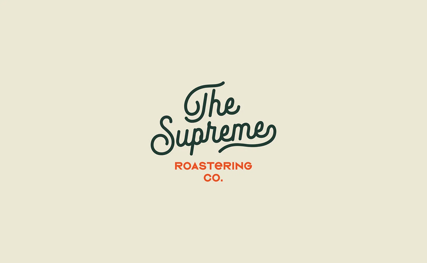
Creating a brand identity with a vintage and minimal approach for The Supreme Roastering Co. The inspiration for the colors of The Supreme comes from coffee beans. At the same time it was supported by orange tone in order to create contrast. We also used cream tone and soft colors alternatively. It is a vintage, simple and minimal branding / packaging project. We hope that you like it!

Scientific Anglers

SA_01.jpg
SA_02.jpg
SA_03.jpg
SA_010.jpg
SA_011.jpg
SA_04.jpg
SA_07.jpg
SA_05.jpg
SA_06.jpg
SA_09.jpg
SA_08.jpg

Created by United DSN

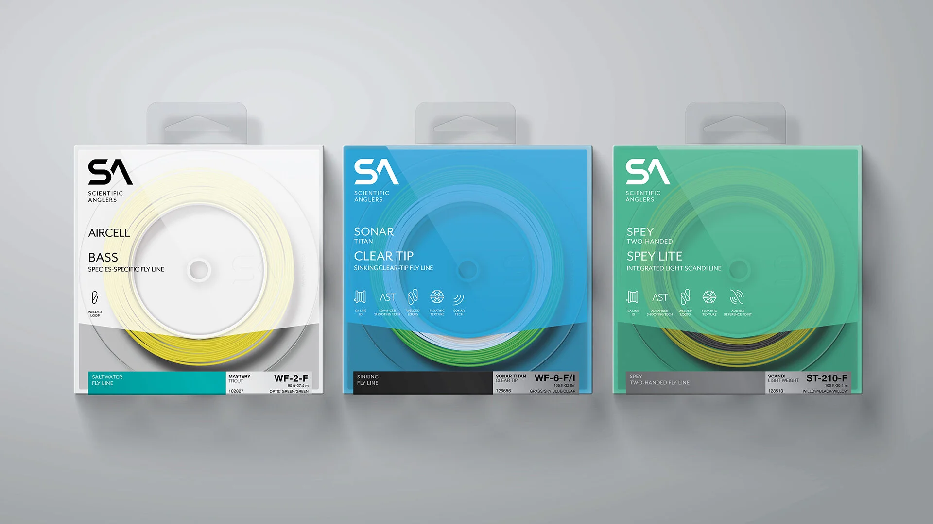
Scientific Anglers was founded by friends and anglers Leon Martuch, Clare Harris and Paul Rottiers, in 1945. Over the years SA has become known as the most innovative and technically advanced manufacturer of fly fishing lines in the world. Year on year the fly fishing industry looks to SA for the latest advancements line innovation, continually acknowledging SA as the benchmark for all others to follow.

Rapid Medical

Rapid 1.jpg
Rapid 2.jpg
Rapid 3.jpg
Rapid 4.jpg
Rapid 5.jpg
Rapid 6.jpg

Designed by xaas branding & design lab

The Montcarotte British marketing bureau presented the world’s first innovative dental cosmetics. The production is based in Europe, where formulas, clinical trials and tests are conducted as well. Most effective yet safe compounds are developed by experts of the pharmaceutical laboratory under the guidance of the doctor of medicine Ettore Tallia – guru in the field of organic chemistry, the head technician of famous American firm of Elizabeth Arden. Montcarotte created a new niche in dental care- SMART LUXE, interaction of technology and modern design.

Tasked to create a logo and packaging for a new line of Rapid from the British company Montcarotte Medical. Since the set is professional, it is necessary to create a sense of reliability and technological efficiency with the help of the company style. The style and principles of Swiss layout are appropriate.

The post-surgical ruler itself has set the tone for future design, the main element of the design is a simulation of a surgical incision. Red is the new white. The red cut line runs through all products and is the main element of the identity. Complete minimalism to show sterility, purity, and innovative of the product. Design without bright colors and extra accents will well remove the product from its competitors. The minimalist nature of the product was very much appreciated by many designers and xaas laboratory got the design of the month in Russia in the community of designers.

Hawkes Cider

Hawkes Cider 1.jpg
Hawkes Cider 2.jpg
Hawkes Cider 3.jpg
Hawkes Cider 4.jpg
Hawkes Cider 5.jpg
Hawkes Cider 6.jpg
Hawkes Cider 7.jpg
Hawkes Cider 8.jpg

Created by Robot Food

The Brief: We're the pioneers of our category with the craft credentials to back it up. Can you raise our brand to the next level and strengthen our position as the Saviours of Cider?

The Opportunity: Hawkes' 'London-to-the-core' attitude and challenge to mass market cider caught the attention of craft pioneers, Brewdog. Under new ownership with the opportunity to scale up distribution and production, our job was to tap into the mindset of the craft consumer and put cider back on the agenda.

-

The cider category relied heavily on farm-grown cues, but Hawkes was born and raised in the city so we amplified their urban attitude and personality to stand out amongst the fields and trees of the competition. We built on existing assets, choosing to hero 'Eddie' the skull as a strong, recognizable brand mark in a system that keeps the range consistent.

New product names like 'Dead & Berried' and 'Doom & Bloom' deliver flavour with plenty of brand attitude, while 'Urban Orchard' was retained as a nod to the brand's history.

Kinder Emojoy

Kinder Emojoy K18 1.jpg
Kinder Emojoy K18 2.jpg
Kinder Emojoy K18 3.jpg
Kinder Emojoy K18 4.jpg

Created by Auge Design

Ferrero is a historical Italian food company specialized in confectionery products, recognized worldwide as the most reliable brand and with the best reputation.

Assignment: Development of the 2018’s collection of Kinder Joy, a summer version of the Kinder Surprise egg, customized in collaboration with Emoji®: the worldwide reference for icons and smileys.

Solution: We thought of a concept to work on: “Say it your own way”, which also became the lead claim of the communication campaign. To make the eggs narrate the concept, the shelves were customized with the mouths of 8 different Emoji® subjects. This allows an interaction between the consumer and the product, that became this way interactive and playful.

Process: Creation of 8 different eggs subjects, as long as the development of different other packagings and communication materials (displays, multipacks, etc.).

Commonlabs Vitamin Kit

COMMONLABS 1.jpg
COMMONLABS 2.jpg
COMMONLABS 3.jpg
COMMONLABS 4.jpg
COMMONLABS 5.jpg

Created by HEAZ

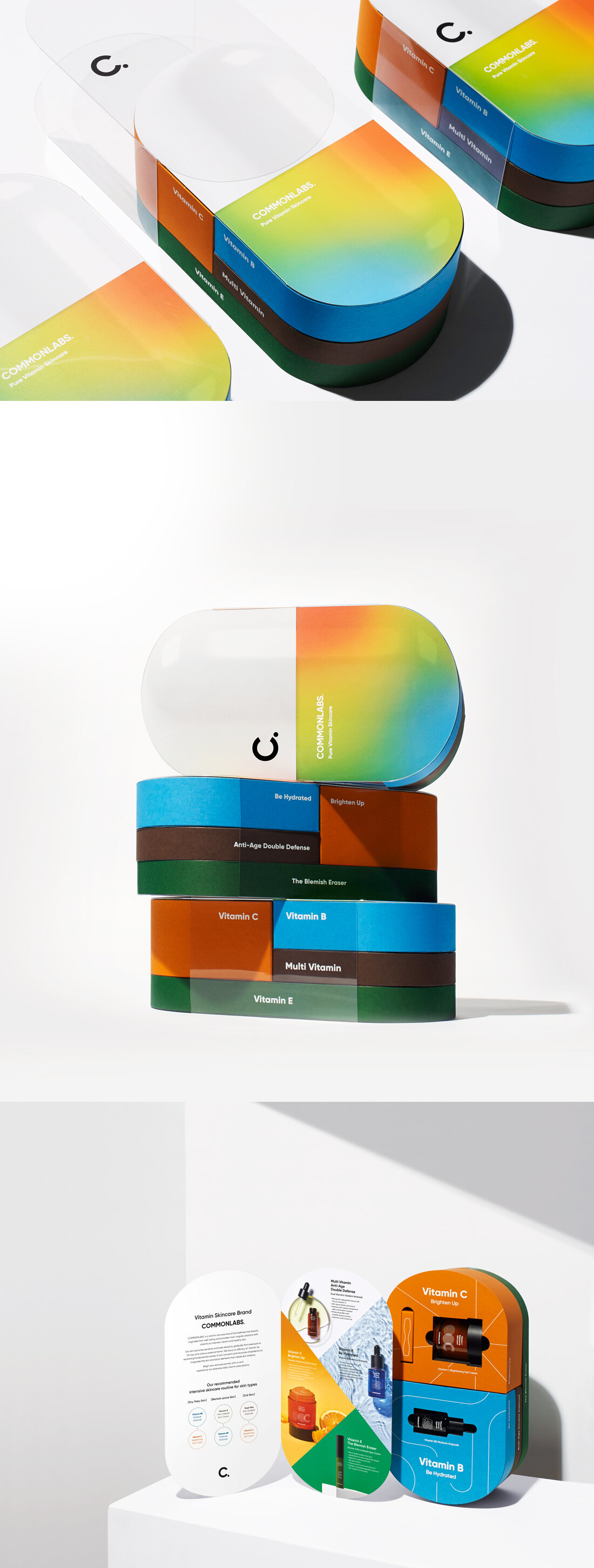
This is the Vitamin Kit of COMMON LABS, a kinetic vitamin skincare brand that aims for healthy beauty. The design that visualizes the shape of the vitamin pills gives the impression that the vitamin directly permeates the skin. The kit can be separated by skin type, just like vitamins that can be taken according to condition, and each product's effectiveness is intuitively expressed by adding a graphic motif using lines to the package. This is a special package, produced in small quantities to promote and deliver the brand’s concept and message. It is provided to reporters and influencers and presented as a gift for the launching and special events.

Rustikao Chocolate

Rustikao Chocolate 1.jpg
Rustikao Chocolate 2.jpg
Rustikao Chocolate 3.jpg
Rustikao Chocolate 4.jpg
Rustikao Chocolate 5.jpg
Rustikao Chocolate 6.jpg
Rustikao Chocolate 7.jpg
Rustikao Chocolate 8.jpg
Rustikao Chocolate 9.jpg
Rustikao Chocolate 10.jpg

Created by Dainin Solis

Crafting a new brand to support young chocolatiers in rural Nicaragua.

MADE IN FAMILY, MADE IN COMMUNITY

In the remote, mountainous, and fertile lands of Jinotega in northern Nicaragua, hundreds of micro and small producers seek to reduce their economic dependence on coffee by cultivating cacao. Their children transform the best beans into artisan chocolate. The final result has deep-noted flavors, rustic features, and a lot of character.

The Rustikao Chocolate Factory was born to complement the Proyecto de Diversificación con Cacao (check the brand project) promoted by the Soppexca cooperative. It allows children of the producers to integrate into the economy of their community by starting a local business: from harvest and processing to packaging and sales of products.

Initially known as Chocolatería Quetzalcoatl, the brand had not achieved relevant recognition despite being in the market for several years. Partly because of its difficult-to-pronounce name, hard-to-open packaging, unappealing design, and lack of communication of their social impact and story.

Challenge

They needed to improve the perceived value of the product to help increase sales and re-launch themselves as a new offering in the local artisan chocolate market.

Working closely with the chocolate factory team, we formulated a strategy and defined the foundation for a new brand. We created a name that was easier to pronounce and designed not only a logo but an entirely new brand visual language and packaging design system that adequately reflects the artisanal and natural character of the product, improving its perceived value.

Developing the strategy

During the discovery stage, we visited the cacao plantations and the chocolate factory to learn first-hand about the history, the processes, and the people behind the product We facilitated a brand discovery workshop with the young chocolatiers and the Soppexcca management team to get a clear understanding of the core of the business, its challenges, and opportunities

We helped them identify and analyze their target audience, understand their needs, and build profiles for them. Finally, together, we defined the objectives, priorities, and central actions of the brand.

Later we audited the management and brand identity to date and visited the stores of the main competitors to get an impression of the shopping experience. Finally, we investigated and analyzed their online communication and behavior.

A name of origin

Although the former name "Quetzalcoatl" was related to the history of cocoa, it was hard to pronounce, complicated to write, and as a result, difficult to remember.

We created a new name: Rustikao. It is simple and different, and most importantly, it would help the brand to communicate its rural origin while making a direct reference to the natural and handmade qualities of the product.

A brand with artisanal appeal

The main goal of the brand renewal was to improve the perceived value of the product by having the visual identity adequately convey the brand attributes. We were looking to achieve a sweet balance between an artisan appeal with a modern hint.​​​​​​​ ​​​

​​​​​​​We provided the brand with a robust visual language that goes beyond the logo, creating a scalable system with several graphic resources, sprinkling flavor, and personality to the brand.

The identity system ranges from a selection of assets and materials with natural finishes, such as kraft paper, a typography pallet with rustic characteristics, the use of worn and irregular details, and an enriched color palette.

We also designed auxiliary graphics such as stamps, alternative logos, and two custom patterns to be dynamically and flexibly implemented on the packaging, stationery, and other touchpoints.

Everland Honey

Everland_Honey 1.jpg
Everland_Honey 2.jpg
Everland_Honey 3.jpg
Everland_Honey 4.jpg
Everland_Honey 5.jpg
Everland_Honey 6.jpg
Everland_Honey 7.jpg

Created by Saworl

Everland, South Korea’s biggest theme park brand collaborated with ‘Ahn Sang Gyu Honey’ to launch a limited edition merchandise that encourages people to have fun again. The title of the package - a slang ‘ggul-jam’ translates to ‘honey-fun’, referring to the extreme level of enjoyment, like the sweetness of honey. Studio Saworl has used illustrations, relevant colors and bold typography to portray the concept of fun packaging for honey products that links to the essence of a theme park.

5Cs Whiskey

5Cs 1.jpg
5Cs 2.jpg
5Cs 3.jpg
5Cs 4.jpg
5Cs 5.jpg
5Cs 6.jpg
5Cs 7.jpg
5Cs 8.jpg
5Cs 9.jpg

Created by Newnam Design

For those unfamiliar with Arizona’s rich history, I grew up learning that the reason Arizona thrived as a state, when laws were questionable and who was in charge changed weekly, was because of the five major areas of commerce for the region. The five C’s of Arizona are Copper, Cattle, Citrus, Cotton, and Climate. All five of these industries injected money into the economy and drove hundreds of people west to stake a claim in the resource-rich desert environment. 

The idea behind this concept was to combine my favorite drink, whiskey, with the 5C’s of Arizona. This is a pure passion project that hopefully shows how proud I am of where I’m from.​​​​​​​

HUZZAH Probiotic Seltzer

HUZZAH 1.jpg
HUZZAH 2.jpg
HUZZAH 3.jpg
HUZZAH 4.jpg
HUZZAH 5.jpg

Created by BrandOpus

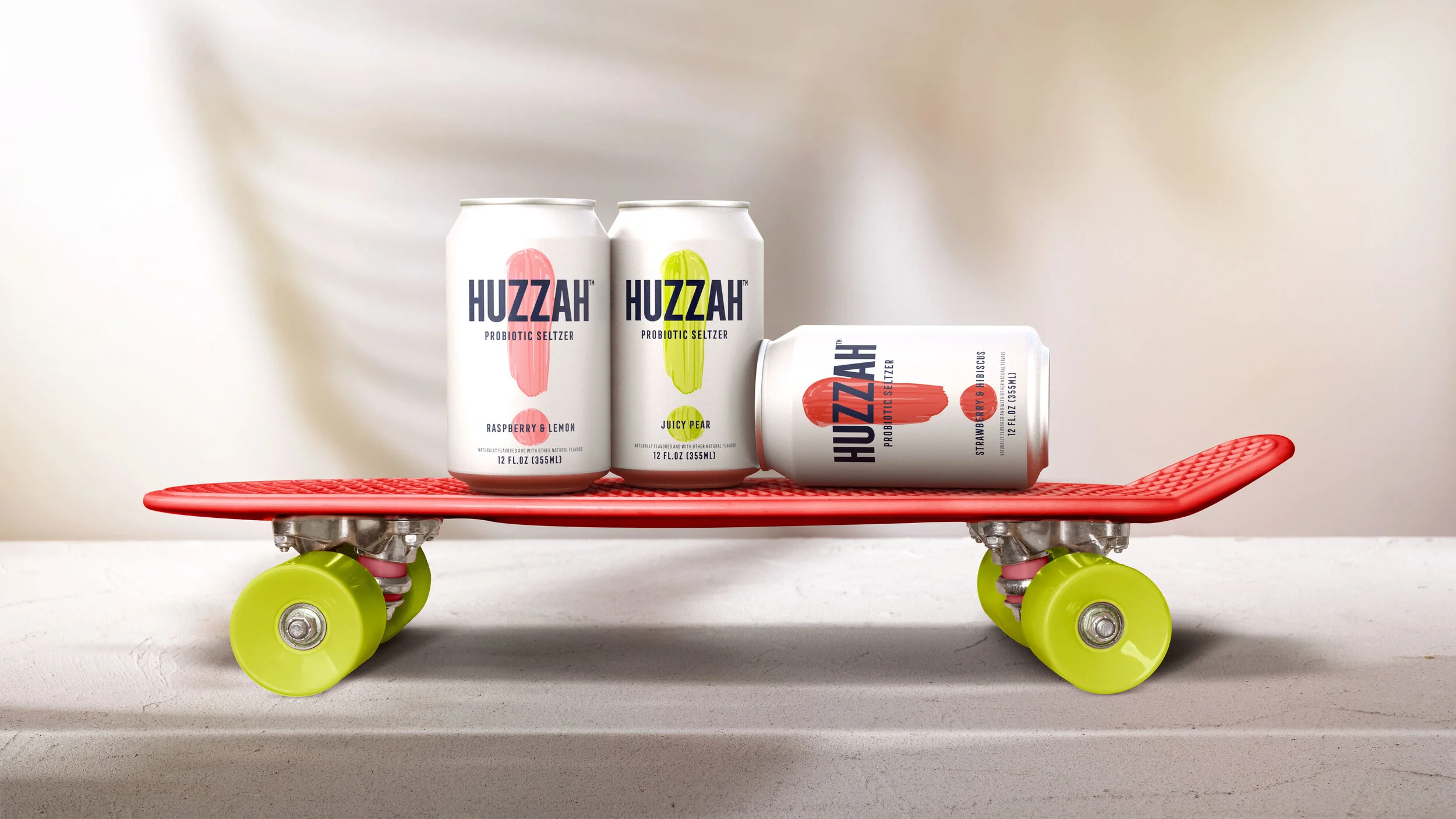
With a bold, graphic style and energetic tone of voice, HUZZAH™ has the ability to make the consumer look and drink twice and make waves in a sea of seltzer sameness.”

With the goal of targeting consumers that live life out loud, HUZZAH™ is energetic and enthusiastic in its branding – from its celebratory name to its bright, neon color palette. The bold-brushstroke exclamation point symbol front and center and the blend of straightforward graphics and photography creates a brand world that aims to break through in the seltzer aisle.

The visual, brand world of HUZZAH™ is a vibrant one that uses pops of colors on a crisp, white canvas to not only engage consumers and reflect the product’s cool, Southern California origins.

SQUID SOAP

SQUID SOAP 1.jpg
SQUID SOAP 2.jpg
SQUID SOAP 3.jpg
SQUID SOAP 4.jpg
SQUID SOAP 5.jpg
SQUID SOAP 6.jpg

Created by Design Happy

The Brief: Squid Soap needed a fun and friendly design that would appeal to kids and encourage them to keep their hands squeaky clean.

Our Approach: To keep kids interested, we created designs for a SquidSoap family with googly eyes, ink splats, popping colours, bubbles, seaweed and a wooden sign that reads, ‘magic ink pump for squeaky clean little hands’. We wanted the Squid family members to be as characterful as possible so kids would want to pick them up and use them everyday.

Laura Chenel

Gershoni_Laura Chenel_CreateiD_04.jpg
Gershoni_Laura Chenel_CreateiD_03.jpg
Gershoni_Laura Chenel_CreateiD_01.jpg
Gershoni_Laura Chenel_CreateiD_11.jpg
Gershoni_Laura Chenel_CreateiD_09.jpg
Gershoni_Laura Chenel_CreateiD_06.jpg
Gershoni_Laura Chenel_CreateiD_08.jpg
Gershoni_Laura Chenel_CreateiD_05.jpg

Created by Gershoni Creative

Laura Chenel crafts goat cheese and goat milk products inspired by the legacy of its namesake founder and longtime owner. After its sale to a family-owned French company that specializes in boutique creameries, Laura Chenel needed to create a brand experience that would re-establish its reputation and shake the deli display from its doldrums.

Gershoni Creative started by elevating the role of an early brand champion (Alice Waters of Chez Panisse) as part of a repositioning as “the original chef’s goat cheese.” We introduced a heritage feel to the brand identity and elevated the terroir through a digital presence so fresh, it could only come from Sonoma.

Entrometido Wine

Entrometido Wine 1.jpg
Entrometido Wine 2.jpg
Entrometido Wine 3.jpg
Entrometido Wine 5.jpg
Entrometido Wine 6.jpg

Created by Jacomy Mayne

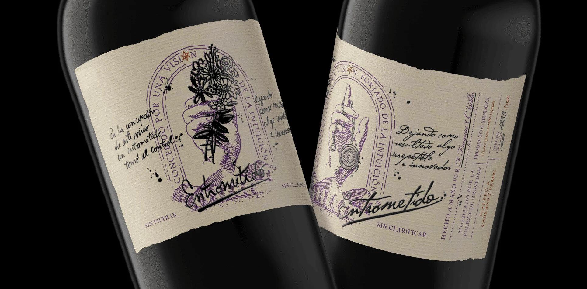
Entrometido is a meddling person that is involved in every part of this hand made organic wine, including the design of his own labels. Made entirely by their owners this small-batch blend changes each year, never the same, just like their labels.

The idea is that this base label is artistically intervened year by year by the “Entrometido“, since each year that passes the wines are different, as well their labels.

Three Bears Ice Cream

three-bears-icecream 1.jpg
three-bears-icecream 2.jpg
three-bears-icecream 3.jpg
three-bears-icecream 4.jpg
three-bears-icecream 5.jpg
three-bears-icecream 6.jpg

Created by Reynolds and Reyner

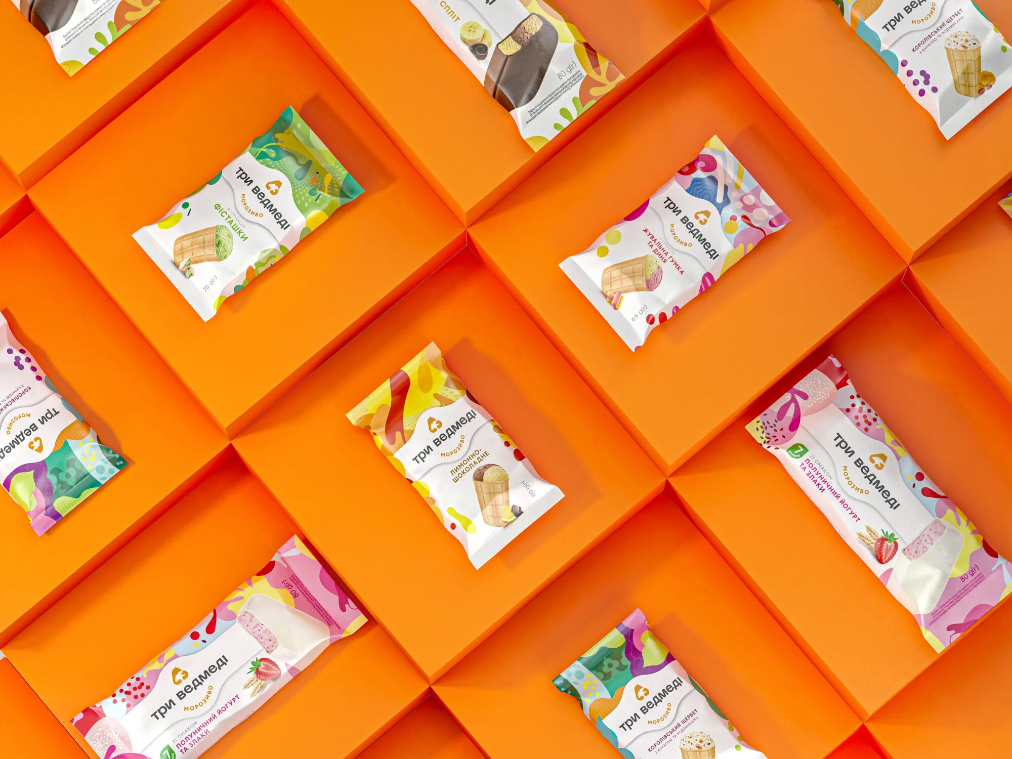
Within the recent 19 years the company ‘Three bears’ has considerably increased its assortment and become one of the TOP 3 industries of Ukraine. However, a certain problem arose. The audience recognizes ice cream but not the entire brand. In 2019 it was decided to consolidate the ‘Three bears’ umbrella brand and unify all its products within a new integral recognizable style. Bringing people together at the same table, walk, hobby activities is the social mission of the brand. It is simply to drag us out of the virtual world and get back to the real one. So, it is the ice cream that gives happiness and it is of great importance to share it.

The key task of the agency was to integrate SKU designed in a diverse way and deliver the emotions that arise when eating an ice cream through the packaging. This is how the clear graphic hierarchy was born. We just gave larger space to the bright patterns, placed the updated logo on a white billet in a close-up way with the most delicious, the ice cream, being on the white background. Paired with the product image, the patterns stand for taste indicators. This is how we solved the issue of packaging functionality. They metaphorically transfer both, the feelings when eating ice cream, and the qualities of the products. It appeared to be bright and emotionally rich, and what is more important, distinguishing among the competitors.    

Special attention is paid to the tastes’ images and we reached the best fit for the packaging content. Images of the ice cream are highlighted by the graphic presentation of the ingredients.  This meets the two-fold concern, suggests the taste to a customer, and makes one want to taste it immediately. Being in the medium-price segment, the ‘Three bears’ ice cream now looks more premium than ever before. Now it is the delicious packaging for the delicious ice cream. So be aware not to eat the whole lot at once!

Borjomi 130th Anniversary

Borjomi 130th 1.jpg
Borjomi 130th 2.jpg
Borjomi 130th 3.jpg
Borjomi 130th 4.jpg
Borjomi 130th 5.jpg
Borjomi 130th 6.jpg
Borjomi 130th 7.jpg

Created by Reynolds and Reyner

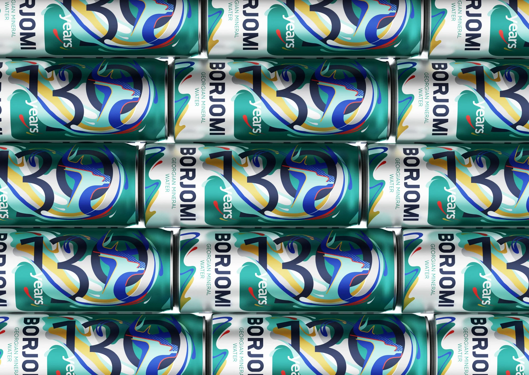
In 2020, Borjomi's anniversary is the 130th anniversary of production. In honor of this event, the brand decided to upgrade on the shelves, as if dressed up for the holiday. And despite the fact that the “anniversary” sounds old-fashioned, the new limited collection looks fresh and modern. Based on the “And you with character” communication platform, a design was developed for bottles and cans, taking into account the emotions of consumers, global trends, and maintaining brand awareness.

The Georgian Green logo, deer, and color familiar to consumers are gradually becoming icons of modern culture. In the new collection, the deer coexists with the numbers 130 in the dynamic composition, which meets the current trends in graphic design. In addition, this composition conveys the meaning of the continuous development of Borjomi throughout all 130 years. The cold color palette preserves youthfulness and freshness of the package, and interspersed with warm colors bring the whole composition to life.

Borjomi is a brand with a long history, which can keep interested in itself, constantly updating and self-improvement. Like his target audience, he is very active and young, despite his 130th birthday - this is what the limited collection conveys. No one knows how else the brand will be surprised, but one thing is for sure - this collection was a success because for Borjomi the 130th anniversary is only the beginning.

Bolgrad Classic Wine

Bolgrad Classic Wine 1.jpg
Bolgrad Classic Wine 2.jpg
Bolgrad Classic Wine 3.jpg
Bolgrad Classic Wine 4.jpg
Bolgrad Classic Wine 5.jpg
Bolgrad Classic Wine 6.jpg
Bolgrad Classic Wine 7.jpg
Bolgrad Classic Wine 8.jpg

Created by Reynolds and Reyner

Wine of Bolgrad is the drink with a rich history. It dates back to 1821 with the architecture of Bolgrad bearing witness to. The city hosted the vintage wine warehouse, one of the core enterprises of those times. So far, there are an extensive range of dessert, dry and semi-sweet wines distinguished with soft and easy taste within TM Bolgrad. The original bouquet is harmoniously combined with many dishes, fruit and delicate desserts, hard and soft cheeses making it a perfect match to cozy family leisure or large-scale banquets.

Redesign of TM Bolgrad started from a semi-sweet line, consisting of 12 types of wines. Within the frames of the project, the unique identity design was developed. It includes the company BG monogram, standing as an extra distinctive element of the brand, ‘Classic Collection’ manuscript signature, and the upgraded logo design. The key identity elements will form the redesign basis of all the products within the Bolgrad umbrella brand portfolio. It is the bottle that has undergone changes as well. A new masculine silhouette with wide shoulders and smoother transitions toward the bottleneck has been developed.

The capital letter ‘B’ unique label cut forms the core design element, and, combined with the new identity, stands as the powerful communication tool with the consumers and the competitors’ removing obstacle. Bolgrad wine means enjoyment for living without any rules and prejudice. No matter whether it is red or white wine, served with fish or Thai noodles, the most important is the company of dear close friends to share the unforgettable moments with. New modern tendencies never matter when one simply wants to enjoy the tasty wine.

Monachus Istria Dry Gin

Monachus Istria 2.jpg
Monachus Istria 3.jpg
Monachus Istria 4.jpg

Created by Bedow Studio

The tiny Monachus distillery sits at the tip of Croatia’s Istria peninsula, where the land dips into the shimmering Adriatic sea. The gin takes its botanicals from the hillsides here and borrows its name from Monachus Monachus, the endangered Mediterranean monk seal that used to live on these shores.

The distillery’s connection to the nature of Istria runs throughout the design, from the seal stamped on each bottle, to the pine cones strewn on the hills behind the distillery. A set of five custom labels shaped by the natural history of Istria: salt and stone, wind and wave, and pine cone.

01 - Insight

You often find that small, independent distilleries have a unique connection to the landscape around them. A sip of Monachus should transport you – however briefly – to the salt-flecked, pine-scented coastline of Istria.

02 - Concept

Every aspect of Monachus gin is defined by its sense of place. Inspired by the natural history of Istria and the Adriatic sea, we drew on the elements that make this place unique: not just the monk seal, but the salt, sea, wind, stone, and pine. And to reflect the craft and care of a small-batch gin, we put hand-crafted elements at the heart of the branding.

03 - Solution

The logomark is a seal tumbling in the waves, stamped by hand onto each bottle. The labels take one of five shapes: the Bora wind, the waves, the salt in sea and air, a pebble from the shore, and a pine cone from the hills. And the packaging is plastic-free, to match the distillery’s ethos.

For smaller, more experimental batches a generic label was designed. The master distiller can easily mark the labels with batch number and flavor.