Kelloggs Reclaim
/


Created by Landor
“ to help Kellogg’s stand out from the crowd, we determined that it could leverage two trends aligned with its heritage: the quest for simplicity and the desire to live well. This led us to a very clear strategy: address the shift to healthier habits by using the Kellogg’s master brand to tell the story of natural grain goodness in a simple and honest way and reclaim its widely recognized assets.
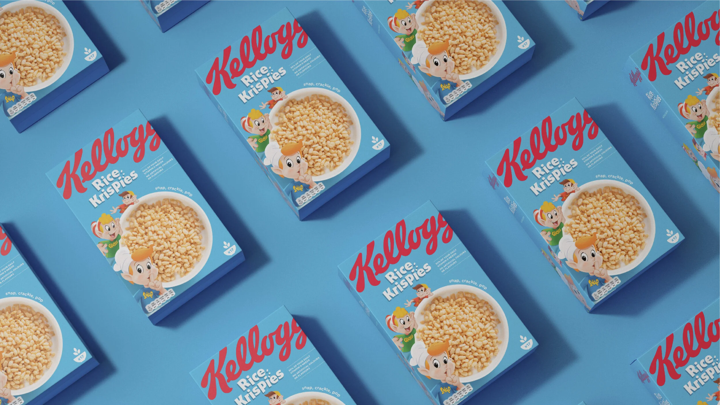
We started by simplifying the packaging, building on the inherent strength of the most powerful brand elements. We updated the distinctive Kellogg’s logo, cropping the wordmark to demonstrate that, even with 100+ years of history, Kellogg’s remains playful and fun. The eye-catching new color palette takes inspiration from fresh, natural ingredients such as vibrant red strawberries and deep purple grapes. The portfolio is now visually brighter, with a wider and more cohesive palette that makes packages stand out dramatically on the shelf.
Regaining category leadership: Our clean, cutting-edge pack design speaks to changing consumer trends. Research results showed that nearly 70 percent of consumers were able to find the new packs on the shelf more easily, and the new designs increased purchase intent by almost 50 percent.
Paul Humphries, vice president of marketing of Kellogg’s Europe, said, “Kellogg’s is one of the world’s most recognizable brands and our cereal boxes are a staple of most people’s breakfast tables. By marrying the best in design with the best cereals, we’re confident our new packs will be a real showstopper on supermarket shelves.”