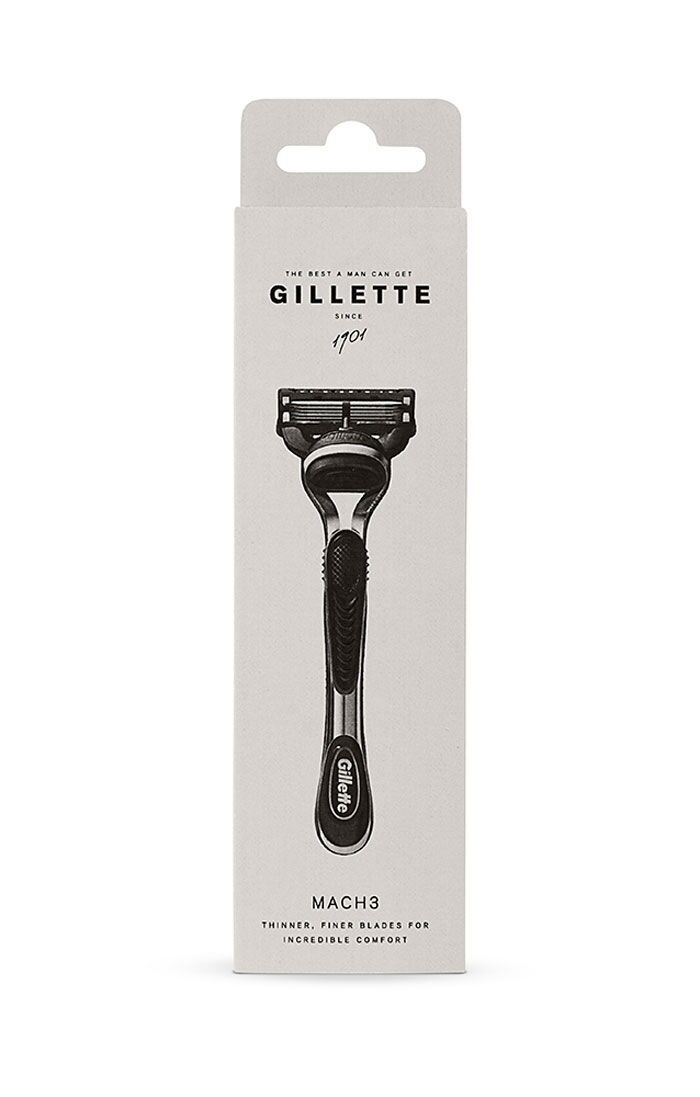
The minimalist trend is set to continue and within the noise of all impressions we experience, people are looking for the simple and human, real and personal. Gillette’s story is worth being told and the design will reflect the quality that lies behind the technologically advanced products.
CREATEiD

Hawkes Cider
© 2007–2019 CREATEiD - All rights reserved. | All images © of their respective owners.


