Pereg Grains
/Created by SQUAYNY
“ For over 100 years, the artisans and gourmet experts at Pereg Natural Foods have scoured the world in quest of superior quality, all-natural ingredients to bring to the table of every family. What started as a small Israeli spice cart in 1906 is now a multinational wholesale brand offering a cornucopia of organic grains, spices, and herbs. This family-owned business thrives off of the rich tradition and expert craftsmanship that goes into their food products.
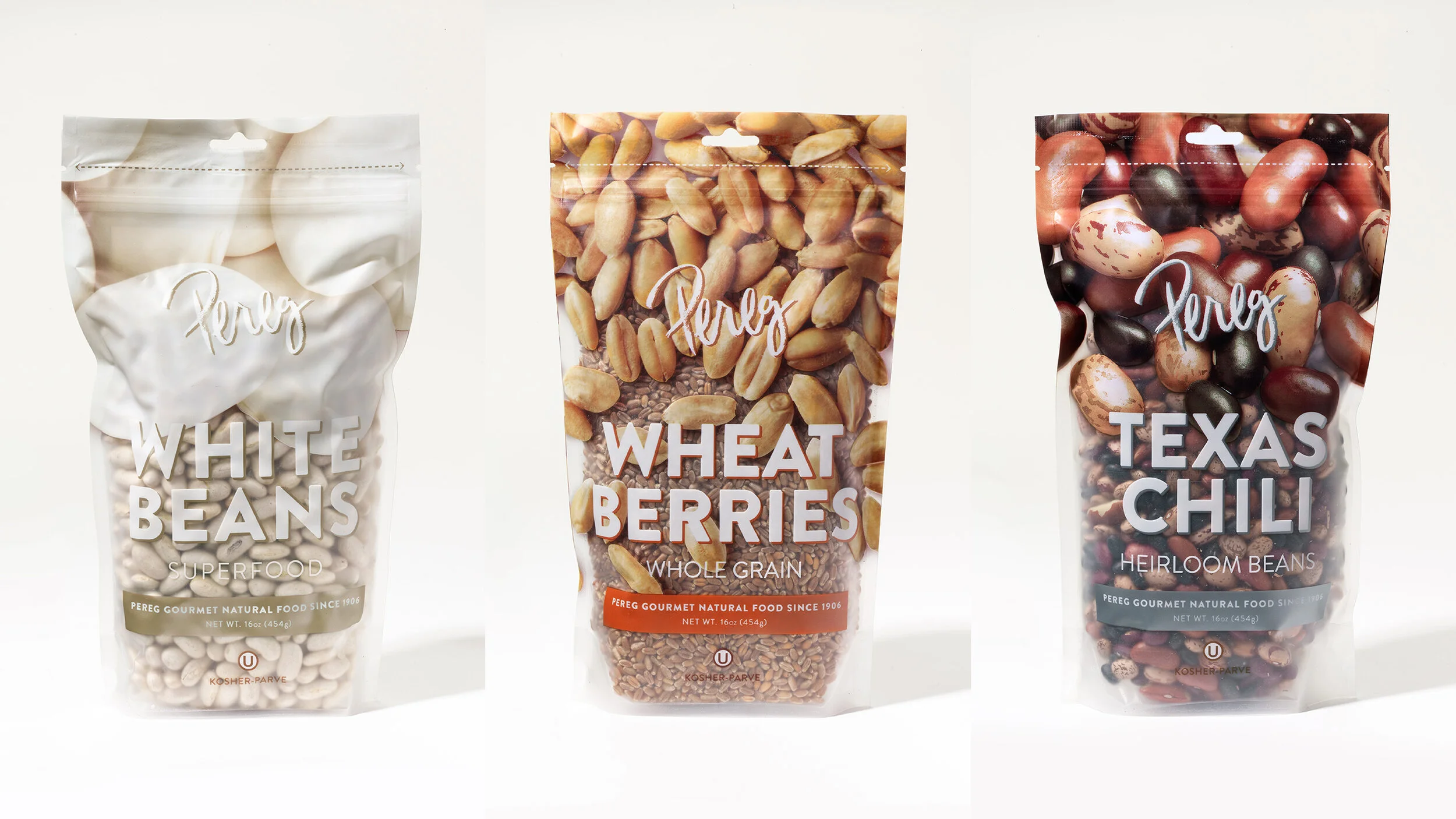
Having developed 21 different types of grains, Pereg needed a way to package them in a trendy and effective fashion. As usual, they turned to Squat New York for packaging designs that adhere to the brand guidelines – communicating their signature wholesomeness – while still offering the grainline its own authentic look.
In our color quest, we decided to identify the richest hue of each grain variety and make it the primary shade of the packaging labels, logo, and various typographic elements.
Inspired by the natural shapes of the grains in all their glory, we slapped extreme close-up imagery of the grains across the top half of the package, which gradually opens up and grows more scattered towards the middle. The images nearly blend with the real product inside, peeking through transparent windows in the sleek, matte materials. With every nook and cranny so ostentatiously on display, there can be no doubt about the product’s freshness, quality, and purity. “


