WATER+
/


Created by Erik Musin
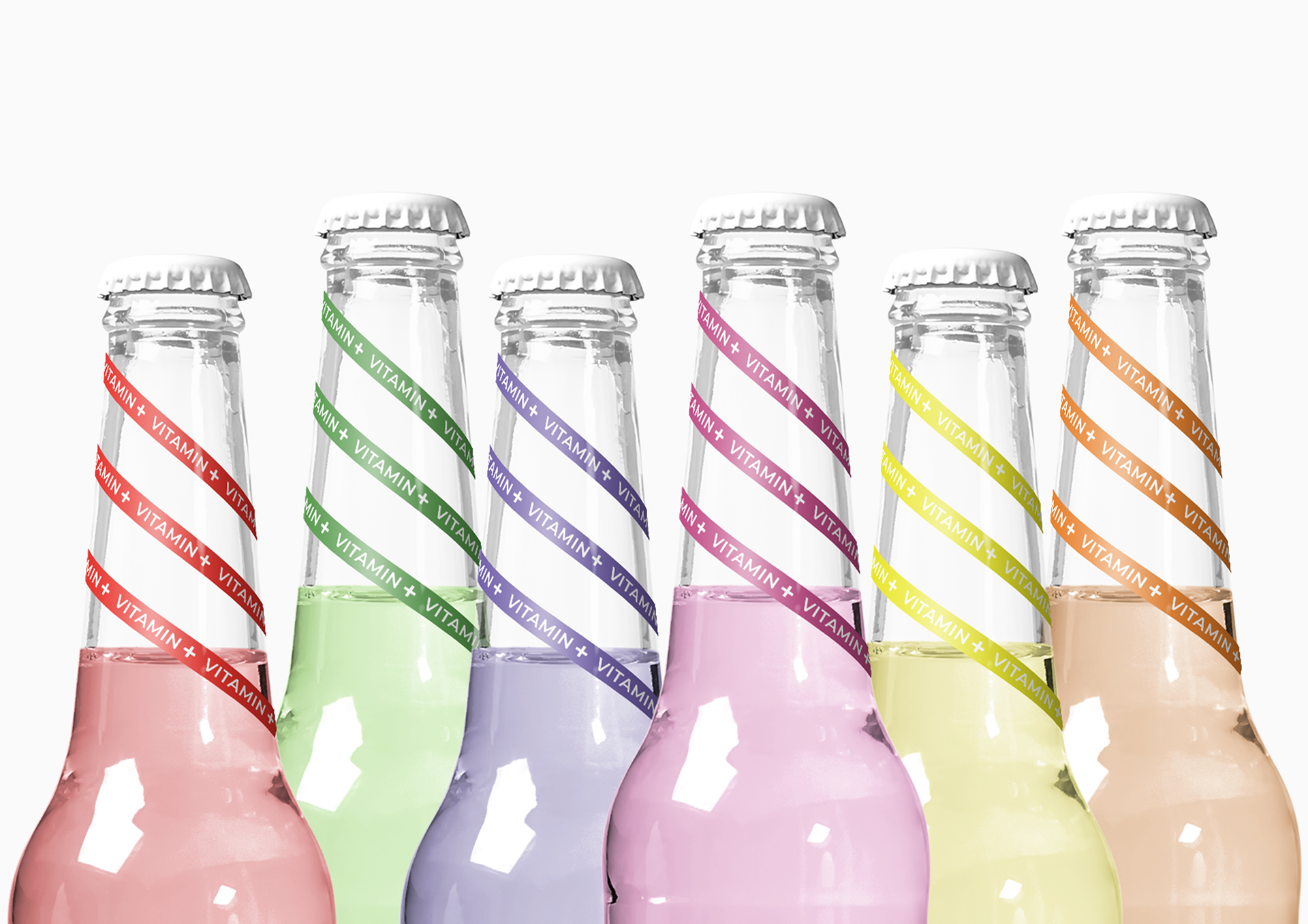
“ The customer set the task of creating a logo, brand name, packaging, and label for mineral water.
Solution: The designer developed a strategy to create a holistic visual style for brand positioning and promotion. Particular attention was paid to the development of visual perception by the consumer of the image of lightness and purity, reflected on the label "Water". And the selection of a translucent, calm color scheme from light to dark favorably emphasizes the entire visual concept of the product. An important stage in the work was the development of differentiation of bottles by volume in order to preserve a single visual picture. Particular attention was paid to minimalism and lines that favorably emphasize the naming of the product, it’s positioning, and perception by the end-user.
Thus, the created design looks advantageous, concise, simple and at the same time introduces a certain premium, but does not go beyond the price segment. “