TripleBogey Brewing Co.
/Created by Paul Rezar and Geoff Tait.
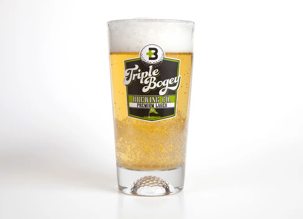
When trying to design the look and feel for golf’s premium lager, we spent a lot of time trying to figure out how to best represent both a great tasting product and appeal to the average golfer (those who are all too familiar with triple bogeys on the course already). We first came up with more than 50 different ideas for the brand and ultimately circled back to one of our first ideas. It’s simple and clean and people instantly get the +3 (three over par) and “tB” for Triple Bogey. We then had to figure out how to use our logo on a beer label. Using just the +3 logo on the can looked too much like an energy drink and that wasn’t what we were looking for. We went through several versions using different golf imagery such as golf carts but the problem was we didn’t want people to be to think about drinking and driving, even if it’s on the golf course (always drink responsibly)! We love the idea of our beer being the preferred brand of the 19th hole. Something the average player can enjoy on the course but also after they’ve shot a round and are just relaxing, recounting stories on the patio. Having a green can was the perfect way to stand out on the shelf. We added pin-striping along the bottom edge as stylized grass, another nod to the world of golf. We are carrying these ideas through all of our marketing collateral, from glasses with a golf ball in the bottom to custom beer taps. A Triple Bogey has never been so easy to swallow! Better hit another!


