Proof Schnapps
/Along the kitchen wall of Zeus Jones, you’ll find more than a few bottles of alcohol.
Among the neglected butterscotch schnapps and the bottle of Boone’s Farm, we’re patiently letting age, we guarantee there will always be a few bottles of single malt scotch whisky. Our love of the stuff is only natural, considering our CEO, Rob White, grew up in Scotland, and that there are more than a few whisky tasters at our long table. The purity of Scotch whisky makes it the king of whiskies, allowing it to reflect the region where it was created and the ingredients that went into its distillation. So when recent creative applicant Dan Horan came in with a sketch for a whisky tasting iPad app, you can bet we snatched him up and set to work developing it. We hunkered down in a room and discussed how the user experience should go, coming out with an experience that was more inspired by board games than anyone example of technology. We wanted it to feel social and democratic, easy for anyone to enjoy. Many angles were considered, from developing a “host” character to making a brainy trivia game, but we decided the approach that felt the truest was making the app a tour of Scotland. For the identity, we came up with the name PROOF, a play on proving your knowledge of scotch, and also on the concept of alcohol purity.
To us, this app was about more than proving knowledge of scotch – it was about proving to ourselves that we had agile enough resources to rapidly prototype a successful app. Inspired by the iterative process used by Google and many rapidly growing start-ups, we designed PROOF in a non-linear, non-hierarchical series of sprints, perfecting it here and there until we had a finished product. It was important to us that PROOF remained device agnostic, so we avoided the many app store restrictions out there and designed it as a mobile site, taking extra care to make sure it felt like a native experience on a touch screen. All of PROOF was made in HTML5, using some of its most exciting features, including its canvas API, which allows players to visually represent their impression of each whisky.
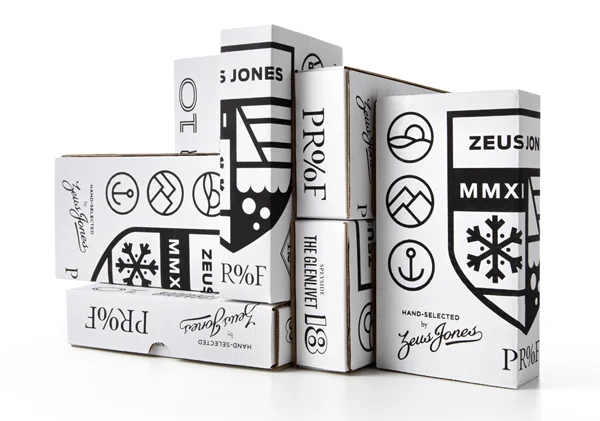
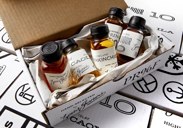
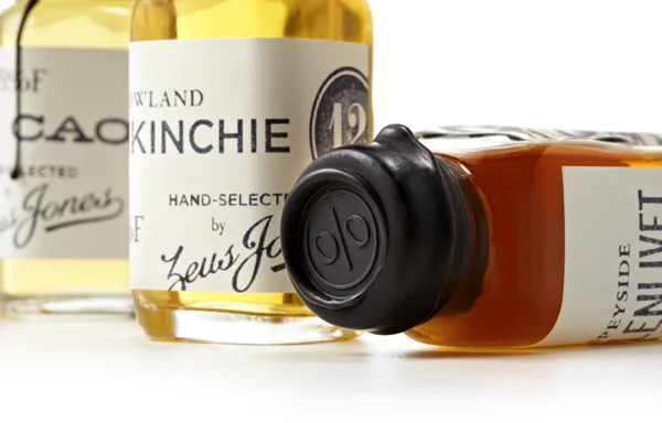
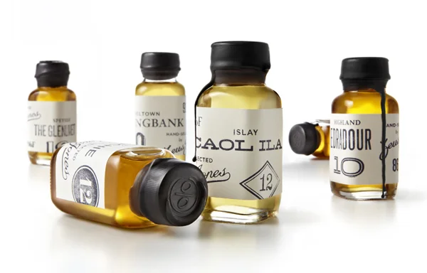
What’s a scotch tasting without the scotch? To make PROOF’s complimentary kit, we carefully considered the details and sweated outside of work hours to bring them to life. Because PROOF is a tour of Scotland’s whisky-making regions, we carefully chose the whiskies that we felt best represented the area where they were made. While there is plenty of creativity and variation among Scottish whiskies, we went for the single malts that stayed truest to their home base. Each of the labels was hand-stamped with a custom design, which blended PROOF typography with our alternative wordmark, a script logo that was originally made to decorate the jerseys of the unofficial Zeus Jones cycling team. To add to the mystique of holding a bottle of fine scotch, we hand-dipped every single one in wax and stamped them with the per cent sign from our PROOF logo.

