Nicks Health
/


Created by Bold
“
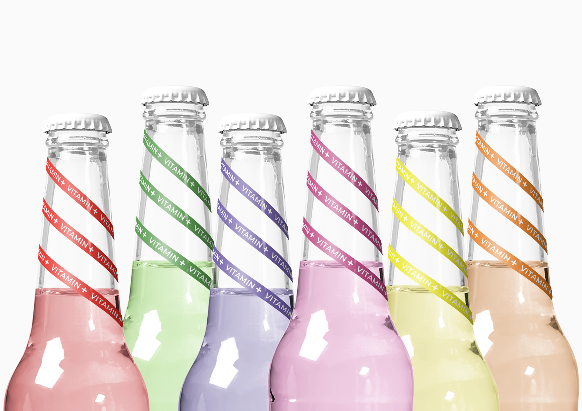
The packaging design was inspired by the 1980s punk subculture style of writing and gave the brand an edgy tonality and typography that was needed to bring forward their strong message. But it also needed a design that would be able to “pop” on the shelves and look delicious. So the dot-pattern was born. Happy and playful dots create brand consistency and are carriers of important messages.
Went from a nutritional diabetes brand to a household brand. Products ́pop ́ on the shelf, creating curiosity and easy navigation. Received listings and strong traction from distributors across the world.
Tripled sales in YR1 from 1 million EUR to forecasted 3 million. Anchoring the core purpose of the vision in the packaging design. Won ‘Best in Test’ against the leading candy brands.
“